Wednesday, 29 May 2013

OUGD402: PPP Presentation


Slide Transcript:

01. Hey everyone my names Samson and I’m a graphic design student. I’m 19 years old and from a small town in Suffolk called Beccles. Moving to Leeds was a slight culture shock for me, I’m used to the countryside and beaches as well as knowing the names of practically everyone in my town. I’ve always considered my self more of a city dweller, but moving to Leeds has taught me that the countryside will always be my home.

02. Moving to Leeds has been the best experience in so many ways and taught me valuable life lessons, before moving here its safe to say I was a bit of a mummy’s boy, I think mentally I have matured loads throughout the year I now know how to use a washing machine, I’m a pretty decent cook, but I still leave my dirty socks all over the place.

03. A change in attitude. Studying for my place on this course was pretty hard, I came straight from A levels, and wasn’t really expecting to get a place here. All in all I was a pessimist. I didn’t have any self belief and often thought my work was inadequate. Gaining a conditional offer on the course really helped boost my confidence and gave me a challenge to work towards in my A levels, it turned out pretty good and I was really pleased with my results. I still struggle with my confidence and self belief, but over the year I feel I have made real progress in changing my attitude towards my self, and try to be more optimistic in all areas of my life, not just my design work and studies.

04. As a designer I feel that I have developed lots over the past year, I feel that my development may have been slower to start with than others on the course and for a while I felt like I was just sailing through it, rather than relishing in the experience and challenging my self as much as possible. I think that as soon as I changed my attitude and started challenging myself a lot more my design worked began to improve; this is reflected in my grades that have continuously crept up, and will hopefully continue to do so.

05. I like clean modernist and functional design. I prefer organized uncluttered design with a clear purpose and meaning. I think over the past year my work has developed dramatically. I prefer muted, monotonous colour schemes with an injection of colour.

06. I think that I have number of strengths that I have shown this year, I think I am hard working and always passionate about what I am doing. I have used my photography skills for a number of briefs this year that has helped show a skill that I have. I think my strongest area of graphic design is editorial, but still want to experiment more within the other fields such as packaging and brand identity

07. Time management is still a major downfall in my work I think that I have made an effort to improve this throughout the year but it is still lacking. Not being well organized and on top of things has often left me feel anxious, nervous and stressed. In the last OUGD406 brief ‘Speaking From Experience’ I planned my time well and was finished in a good amount of time. I struggled with Group work briefs this year often afraid to say my piece and stand up for what I want to, this is something I need to work on. Before starting this degree I did all of my work on Photoshop, it was really hard to come out of my comfort zone and challenge my self to use these programs, I think I have a long way to go to develop my understanding of these but have made good progress this year to learn the basics.

08. The publication I designed for context of practice is my favourite and in my eyes strongest piece of work I have created whilst on the course. I think I had considered every aspect of design and produced a well thought out and planned design. I think that although this is my strongest piece of work it is let down by the essay component that I struggled with.


09. I wasnt happy with this brief. I think it looks rushed and unprofessional. This is an example of work I left till the last minute, as a consequence its un developed and not up to standard.


10. I’ve found it really interesting learning about colour theory, it really interested me and I loved the scientific side to it. Time management has been a massive learning curve for me, I feel that I have learned what not to do… not leaving everything to the last minute, but I now need to make sure I practice what I preach. I have developed a basic understanding of some of the Adobe software but need to practice further. I have loved going to workshops this year, I’ve found them really interesting, unfortunately I haven't used the facilities such as the print room as much as I would like to but plan to do so next year.

11. I am inspired by a number of different things. In particular modernism an the Bauhaus. More current influences include Anthony Burrill, Massimo vignelli, isidro ferrer and Si Scott. I also have a subscription to Wallpaper magazine, which I love. I find inspiration from a number of different resources including blogs such as graphic design and tattoos, Designspiration.

12. Over the summer and during the 2nd year I plan to develop my design work, as I feel I am now at a place where I know what I want to be doing but dont have all the skills to get there. I want to visit lots of galleries and museums over the summer and maybe contact some agencies and designers that I like in order to start networking.

Friday, 24 May 2013

OUGD402: PPP It's Up Yo You


DESIGN PROCESS:

From my research i have decided to make a pack comprising of a business card, book and dvd form of my presentation. I'm planning on cresting a functional folder like design, rather than an elaborate over the top box.


LOGO DESIGN:


I was looking to create a logo that is clean simple and clear. This is the logo design I decided to use, I think it really shows mw as a designer. The letters play with the idea of hierarchy of text. The simple muted design is also highlighted by the bright pop of yellow used in the square. The 

BOOK DESIGN:

I Started off by creating some different thumbnails of proposed page layouts.


Here are some hand drawn layouts that i have created. I always find it easier to start with a paper and pen, and then move on digitally afterwards. I think that physically drawing layouts helps me visualise my ideas and realise them in a  more systematical way.


Next I moved on to digitalising my layouts. This helps me see my ideas in a regimented neater format.


This is my favourite layout thumbnail. I think it is simple and effective. I want to make sure my book is both legible and readable, choosing a simple page layout such as this will help aid that.


Here is one of my double page spreads. I have tried to make it consistent with my logo design by incorporating the yellow square.


I have used this layout throughout my book to help break up the repetition of the layout above. I think it works really well as a page breaker and adds a new dimension to the book.

BINDING:

For my binding process I decided to use a saddle stitch method which involved sewing the book together. I chose this method as I think it shows my interest in crafts and manual techniques. I also though it would add a personal touch and high quality finish to the book.


I started the process by making holes down the spine of the book, making sure they were evenly spaced, and there was an odd amount of holes.


Contact information flyer.

CD case


Monday, 6 May 2013

OUGD406 Speaking From Experience: Evaluation

EVALUATION:

I think that over all my work for this brief was good. I feel that i created a decent amount of work for the time period provided. My work developed as the weeks progressed and my end result had strayed from my original brief slightly, however i think it serves the purpose and if i was a first year student i would be pleased to receive this. I also increased the work load adding a publication after it was suggested from one of the crits that i needed enough work to show for the whole period of the brief.

I think that the downfall of my project was time management, unfortunately i didn't plan my time sufficiently enough and consequently didn't get to try as many different techniques as i wanted to. Saying this, i think that the method of production i chose suited my end result. 

Friday, 3 May 2013

OUGD406: Speaking from experience Crit

CRIT:

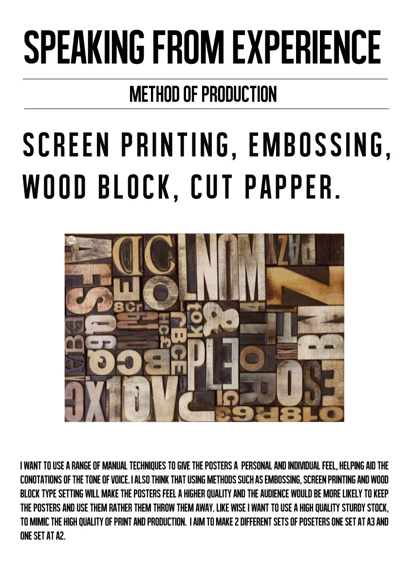
In prior preparation for the crit we had to produce a set of design boards outlining our concept, method of production and method of distribution. We had to present our initial ideas to Simon and 3 of the 3rd year students as well as a selection of our peers.


FEED BACK:

The general feedback that I received from the crit was positive. Everyone like my ideas. One of the 3rd years mentioned that my design boards above, looked like news paper articles, and maybe I should think about creating a publication to go the posters. This was something i had consider to make sure i had a decent proportion of work to show for the final submission. I think my crit went well, i need to start designing and generating ideas. Taking some designs to the crit would have proved more beneficial as i could have gained feedback from the content of my work, not just the concept.


Thursday, 18 April 2013

OUGD402: Where Am I Now?

5 examples of websites/blogs that will help me to define editorial and publishing design;

5 examples of websites/blogs that will help me to define product & packaging design;
5 examples of websites/blogs that will help me to define information & way-finding design;

5 examples of websites/blogs that will help me to define retail & promotion;

5 examples of websites/blogs that will help me to define branding & identity design;

This is an example of well organised information from a magazine that is in a grid like format similar to swiss modernists design.


This is a very simple publication design that embraces the huge white space with the use of a minimal geometric pattern. I like the use of different size texts and the staggered sub headers act as a stepping stone for the eye to follow. It's all very precise and well laid out making it easy to read and understand.


This is a different style of publication compared to the other 2, this one only contains a small amount of text and is mainly photos organised into a grid structure. The variation in margin size between the larger and small sized images means no single image detracts attention away from any other image, even though there is one large image and the rest are smaller. The minimal colour scheme also leaves the attention solely fixed on the images and the use of off white stock means there are no large white boring spaces.


The reason for adding this to my selection of publications is the combination of colour, layout and images. I love the way the saturated coral colour works in harmony with the the grey scale photographs. The simplicity of the text layout and the complex organisation of images into a grid like structure that works extremely well and comes off so simple and minimal.


This is similar to my first example but this time with more colour. I'm not really a fan of the colour use for body text on the white stock because the contrast hurts ones eyes and is difficult to read. Because of the use of bright orange on the white stock it makes the images look very black and like they don't belong on the publication.


This publication from Esquire illustrates the correct way to use orange with white stock and greyscale images. By keeping the orange text to a bare minimum and using it as a background to white contrasting text it makes it a lot easier on the eyes to read. Also the tone of orange also plays a factor in the success because it is more red and darker it's more of a contrast than the previous more yellow orange The greyscale images are a lot more subtle as well meaning they're not looking out of place fighting for attention, the whole piece works together in harmony.


This is a good example of text and image working in harmony. I particularly like how the images have been set out in a grid like structure but show no actual borders making it less obvious but also showing more white space. The text has been kept to a simple bare minimum structure forming just one page width box at the bottom of the page not detracting from the main focal point but also not invisible.


The organisation of images is the key point in this publication, the designer has effectively utilised the entire page to convey the images. I particularly like that there is structure but not so precise, for example some margins are bigger or smaller than others and the text isn't centred but it is all executed perfectly that it looks tastefully and not like a giant mess or collage of images.

Products and packaging-


This novelty idea to package brushes so they look like moustaches and goatees is genius. It makes the product stand out from the rest and instantly draws in attention meaning customers. The design is extremely simple as well it's simply a sleeve with a hand drawn face on the front, there's nothing elaborate, it's just original and unique which sets it apart from the rest of the brushes on the market.


This calendar supposedly soaks up ink from the bottle at the same rate days go by which fills each day with colour. If this actually works it is crazy, it'd be the best thing since sliced bread. It again is more focused on the concept as opposed to the product itself, it is pretty simple in design, it's simply numbers connected to each other.


This is packaging for a black colour water, it an extremely creative use of black on black. As the water slowly goes down a message is revealed which is obviously hidden by the black water. The message relates to the process of drinking the water and is a pun of drinking a black drink means you've moved to the dark side. It's an extremely simple and stylish bottle with minimal text on the bottle which shows of the product inside. Usually bottled water can have crude tacky packaging but this water is obviously aimed at more upperclass market.


This is a good looking piece of product design to package eggs but i'm not convinced at all. Yes it is beautiful, minimal and simple but i cannot get my head around how it protects the eggs which should surely be the main focus and feature of egg packaging especially when they're exposing bare egg, surely they'll get broken in transit which I find totally impractical.


I love this modernist style design, I believe the design relates to the oil can because form follows function within the can design therefor whatever is on the outside should follow this. 


I thought I would add something different compared to the rest of the designs I have added. This poker set packaging is based on playing cards and has a card like pattern laser cut into the lid. It's a very classy and unique way to package a poker set because usually they come in in velvet or plastic lined aluminium tins. The wood gives it a more upmarket feel and the choice of colours for the chips and cards is unique as they don't follow the normal bold, brash and garish colours normally used. 


This i s a kind of retro take on milk which is coming back into style with a bang


Information and way finding-


This follows a grid like system used by swiss modernist pioneers. It is hard to read much information but from the title it looks like it based on the neue grafik design. The use of the contrasting red draws more attention to the key bits of info.


This is a good example of way finding, it's bold and easy to understand. When stood at the correct angle it is clearly read, however, it could be slightly impractical because when rushing down the stairs one might not be at the correct angle to read what level they're at and it could just look like a black mess.


This is a very simple and classic example of way finding, It clearly states what is downstairs in a timeless style of design. The tiling adds to the classic, vintage feel to it and the choice of font makes it easily readable.


The bold colours on the concrete background and the size of the numbers makes this example easy to understand and clearly states where the entrance to each floor is by using a simple arrow. It's very clean and simple design which is difficult to go wrong with.


This is a clear very minimal infographic that uses quite a lot of white space and has rather small illustrations. But I think it is cleanly pulled off because they haven;t used a bold black font, they've used a grey lightwieghted font that works in perfect harmony with the small dull toned illustrations and stock. I particularly like the thin weighted borders that surround each section that are barely noticeable because it further adds structure to the design.


The reason for adding this one the complexity and the enormous amount of information that is visually represented on a huge scale. From the image it is difficult to read the text but from what I can see, I can tell it's well structured and laid out into columns and the use of images as a visual representation adds depth and strengthens the info graphic. 


This is an extremely simple example of way finding that works perfectly, the numbers are large and readable and there is a bold contrasting red that indicates the floor one is on. It's extremely minimal but gets the job done well. If I was to be picky i'm not a huge fan of the centred alignment of the text below each number, I would align it differently but that's just personal taste.


The infographic illustrates facts about coffee really well through its clearly organised and well structured text and image. The saturated dull colours work well with the off white slightly cream stock used and all colours work in harmony. The illustrations are a key favourite of mine they add a light hearted touch to facts about coffee which I assume could be quite boring. My only issue is the fact that my eyes are instantly drawn to the '65%' and after reading that I don't know what to read next. 


I always see infographics in a similar style to these and I always think they look aesthetically pleasing but I can never seem to understand them which surely is one of the key features of any info graphic, its understandability. But the key on this one illustrates the meaning of everything perfectly, it acts as a mini map as such. A complete newcomer to the world of infographics who has no interest in potatoes or designs could clearly undertand what this infograph is talking about.


retail and promotion-


These are great little business cards however it's limited to what information can be put across because there is no room to describe yourself or what they website is about. You've basically got to take the risk on hopefully it'll provoke the need to go to the website and see what it's all about.


I love this barber shop logo design, it's traditional in style and simply does its job without over complicating things by adding extra text or images or colour. Just choice of font further enforces it's traditional classic style barber shop being slightly curved and having that shadow.


This is an extremely creative and unique take on quitting smoking, I love the idea of it being illustrated through a game and each cigarette slowly destroys your lungs one by one. I don't know if it would attract more attention than the shock factor images they use in campaigns because it is a slightly more light hearted take on the subject.


This iconic ad from VW is one of few adverts I like, it fully utilises the use of white space with the 


branding and identity-